Lenspex – Digital Transformation for Optical Retail
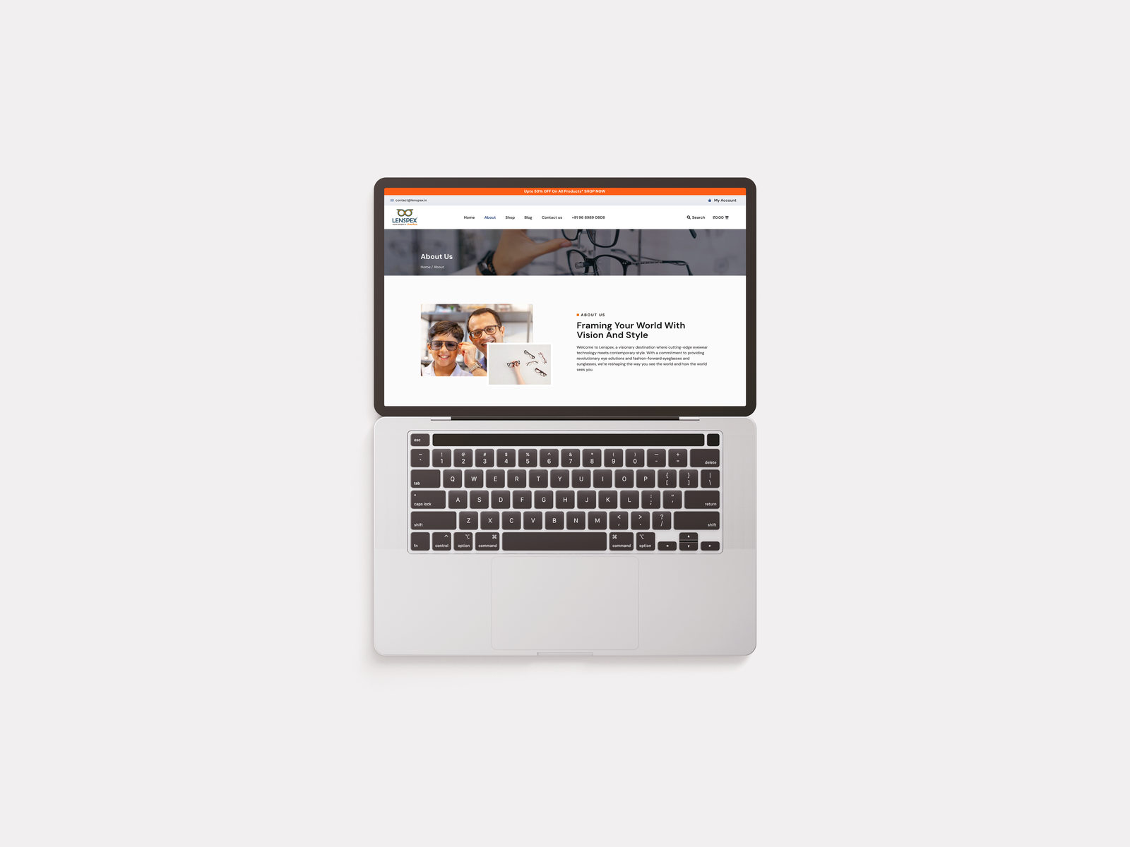
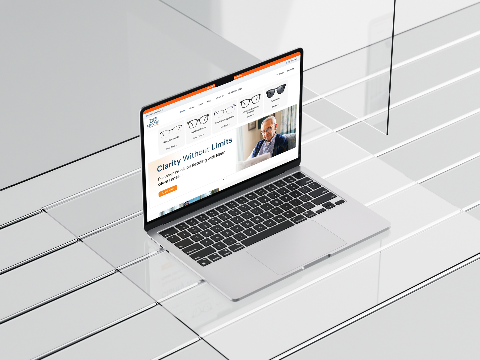
Lenspex is a premier optical retail brand in Nashik with over 5 physical outlets. Despite a strong offline reputation for medical expertise, they had zero digital presence. The goal was to launch a high-performance e-commerce platform that could compete with national giants like Lenskart while retaining the local trust of the "family optometrist." By implementing a trust-centric design strategy and simplifying the complex lens buying process, I helped the brand achieve massive engagement growth in the first quarter.
Role
Senior UX/UI Designer
Client
Mr. Mahesh Salve, Lenspex (Nashik, Maharashtra)
Live Site
lenspex.in
Timeline
2 Weeks (Rapid MVP Launch)
Challenge
"How might I translate the high-touch, medically trusted experience of a physical optical store into a frictionless digital interface, ensuring that users feel confident buying complex prescription eyewear online without human assistance?"
The Core Challenge:
The optical market is dominated by Lenskart, a unicorn brand known for aggressive discounts and vibrant branding. Lenspex faced an identity crisis:
1. Name Similarity: "Lenspex" sounds like "Lenskart," risking the perception of being a "cheap knock-off.
2. Trust Gap: Users in Tier-2 cities (Nashik) fear entering wrong prescription details online.
3. Complexity: Configuring lenses (Spherical, Cylindrical, Axis) is cognitively demanding for average users.
84%
User Engagement
52%
Sales Volume
35%
Onboarding Efficiency
The Design Problem Statement
"How might I translate the high-touch, medically trusted experience of a physical optical store into a frictionless digital interface, ensuring that users feel confident buying complex prescription eyewear online without human assistance?"
The Core Challenge:
The optical market is dominated by Lenskart, a unicorn brand known for aggressive discounts and vibrant branding. Lenspex faced an identity crisis:
1. Name Similarity: "Lenspex" sounds like "Lenskart," risking the perception of being a "cheap knock-off."
2. Trust Gap: Users in Tier-2 cities (Nashik) fear entering wrong prescription details online.
3. Complexity: Configuring lenses (Spherical, Cylindrical, Axis) is cognitively demanding for average users.
The Design Process
I used a rapid, lean UCD framework to meet the 2-week deadline:
1. Discover: I interviewed stakeholders and analyzed feedback from loyal customers like Sudhir Pandit to understand the core value: "Precise Lens for your Specs."
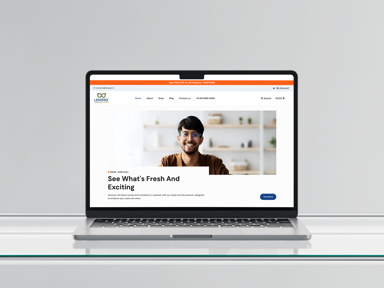
2. Define: I established an "Anti-Lenskart" visual strategy, prioritizing Medical Blue and clean white space to signal clinical expertise over fast fashion.
3. Design: I wireframed the custom "Lens Configuration Wizard" and created adaptive layouts optimized for mobile social traffic.
3. Deliver: I conducted usability tests with local users to refine the checkout flow before final handoff.
Design Solutions & Rationale
A. Solving the "Onboarding" Friction (+35% Efficiency)
1.Problem: Traditional e-commerce forces users to sign up before they browse, causing drop-offs
2. Solution: I implemented a "Guest-First" logic. Users can build their complete cart and configure lenses without an account. Account creation happens implicitly at checkout or via social login.
3. Result: The friction was removed, leading to a 35% improvement in the onboarding process and cart entry
B. Solving the "Trust" & Engagement Gap (+84% Time Spent)
1.Problem: Users usually bounce quickly if they don't see value or feel the site is "fake."
2. Solution:
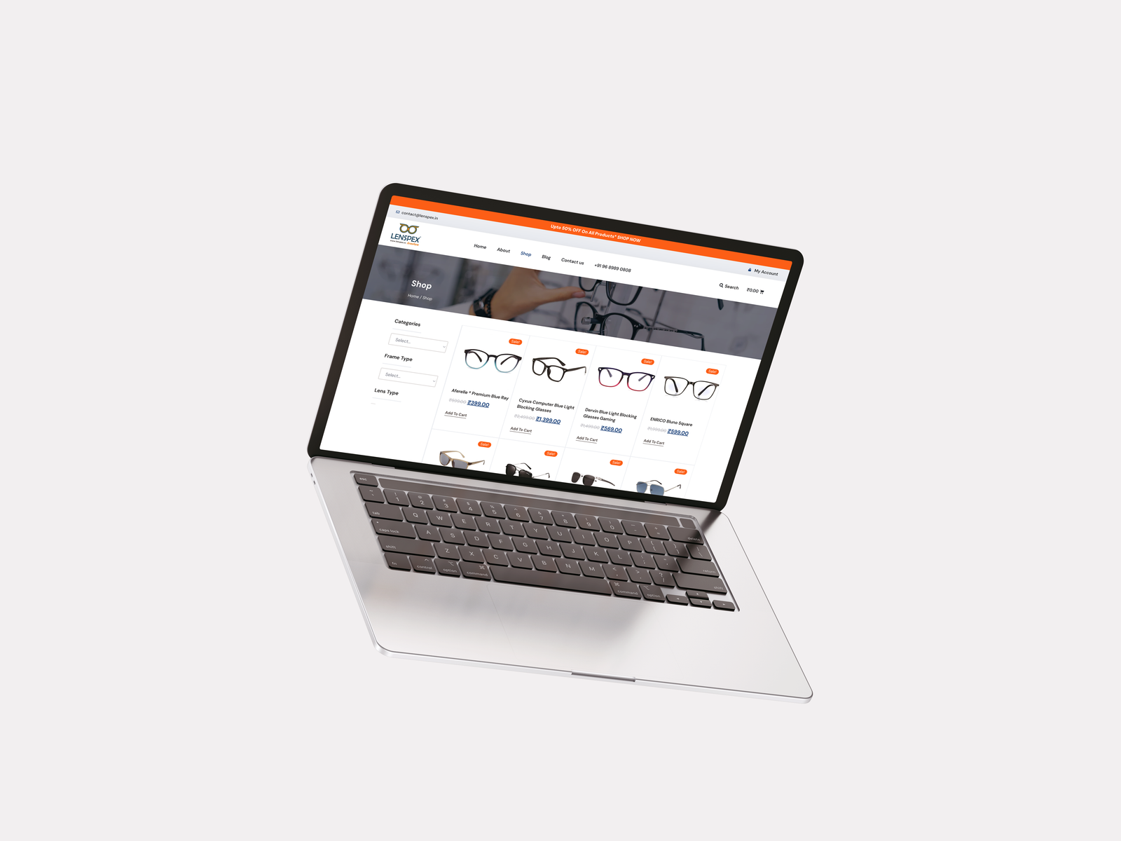
Educational Content: I integrated a blog section directly onto the homepage, featuring articles like.
Detailed Product Pages: Instead of just listing dimensions, I added sections explaining why "Blue Care" coatings matter for IT professionals.
Result: Users stopped "window shopping" and started reading. This educational approach increased the average time spent on the site by84%.

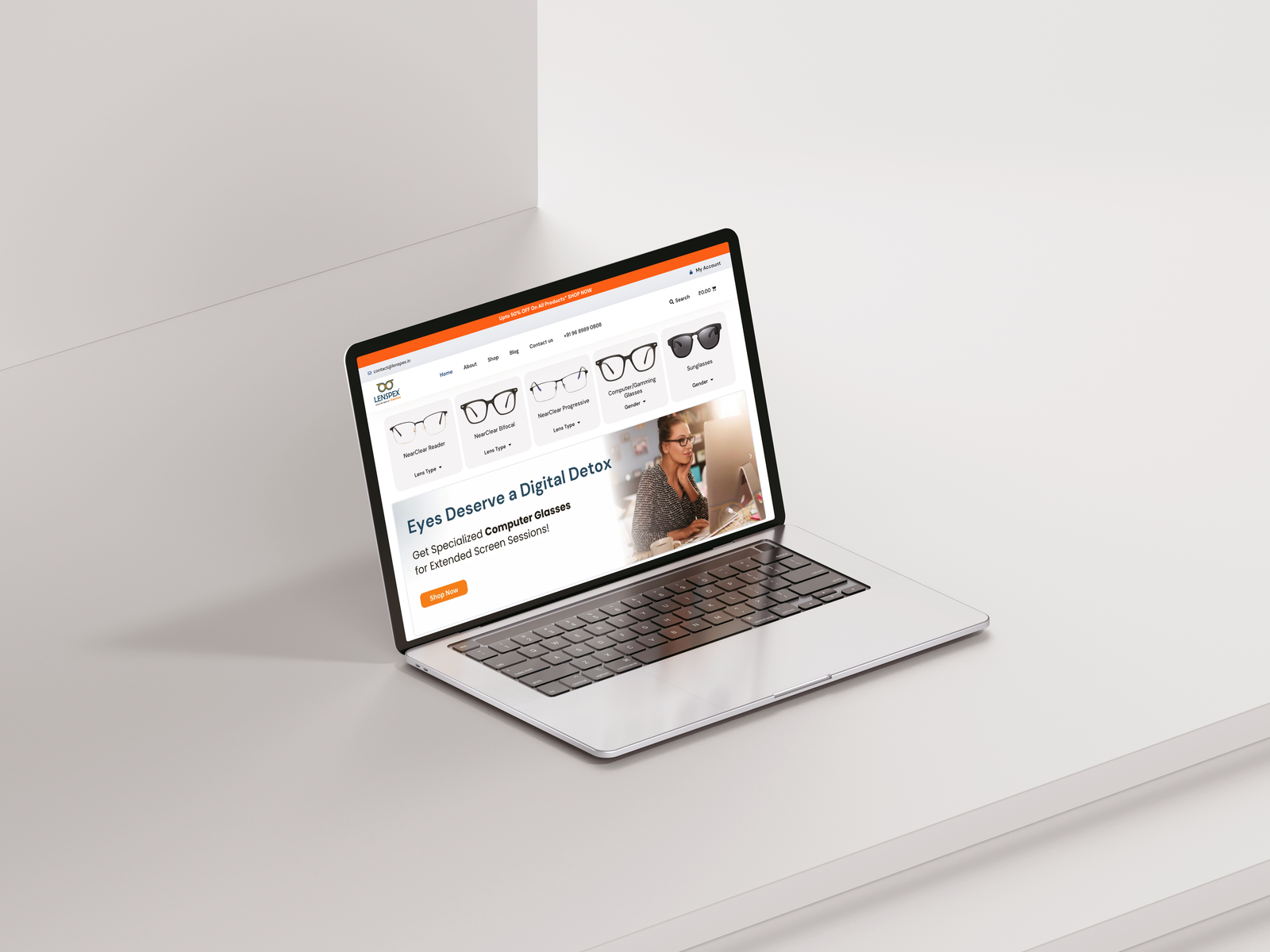
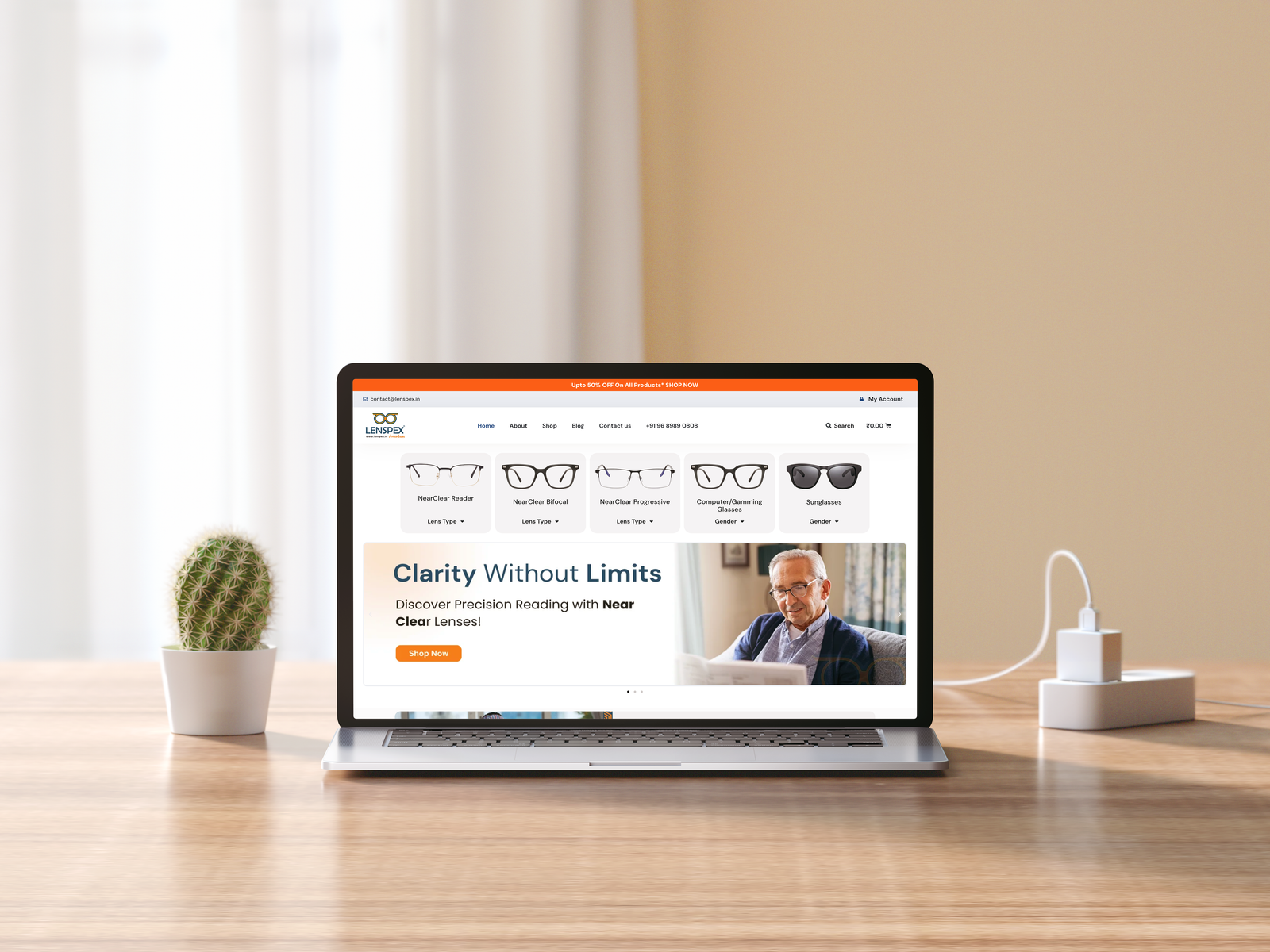
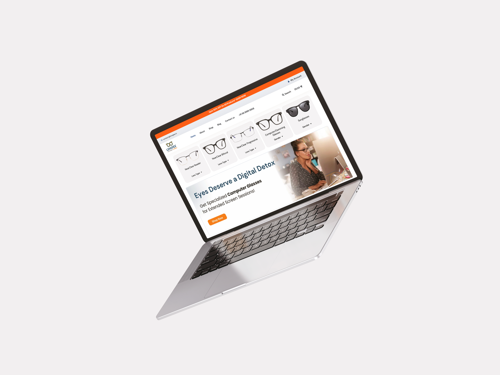
C. The "Smart" Lens Configurator (Iterative Design)
Initial Failure: In early testing, users were confused by terms like "Spherical" and "Cylindrical" and would leave the page.
The Pivot: I replaced text fields with visual questions: "Do you need glasses for Reading or Distance?"
Educational Content: I integrated a blog section directly onto the homepage, featuring articles like.
Key Feature : The "Upload Prescription Photo" button was a game-changer. It removed the fear of typing wrong numbers entirely.
D. Accessibility by Default (The "Genuine" Touch)
Since the target audience includes people with poor vision:High Contrast : I adhered to WCAG AA standards for all text-to-background contrast.
Scalable Typography: I selected Inter with a base size of 18px (larger than the standard 16px) to ensure legibility for users browsing without their glasses on.
Developer Collaboration
To ensure a zero-downtime launch within 2 weeks, I prioritized seamless handoff:
1. Logic Matrix : I created a flowchart for complex lens pricing rules to prevent backend errors.
2. Dev Mode : I provided exact tokenized CSS variables for consistent branding.
3. Visual QA : I conducted a final pixel-review to correct mobile alignment issues before go-live.
Client Review
Mr. Mahesh Salve, Owner of Lenspex
"Swapnil didn't just design a website; he translated our shop's culture into a digital format. We saw a 52% jump in sales in the first quarter. The design is clean, professional, and exactly what we needed to stand out."
Conclusion
This project demonstrates that in the UX of e-commerce,Context is King . By ignoring industry trends (gamification) and focusing on the specific anxieties of the local user (trust, medical accuracy, and legibility), I created a high-performing product. The design successfully bridged the gap between physical retail trust and digital convenience, turning a local store into a scalable brand. End of Case Study


 Lets Talk